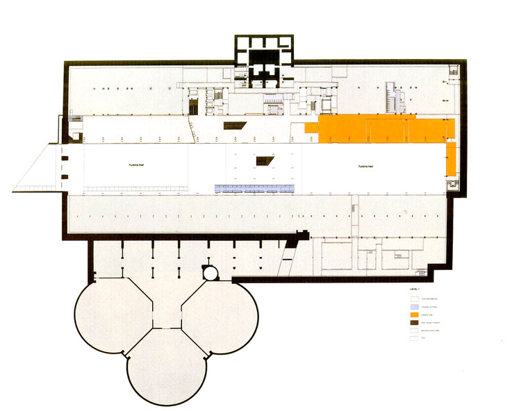
London’s Bankside Power Station stood disused from 1981 until 2000, when it opened to the public as The Tate Modern. Swiss architects Herzog & de Meuron approached the conversion with a relatively light hand, creating a contemporary public space without diminishing the building's historical presence. The impressive cultural icon has since become the most visited museum of modern art in the world, revitalizing its formerly sequestered, industrial neighborhood.
The architects were selected from among several well-known contenders in an international competition in 1995. The Tate Gallery recognized the potential of the power station and felt the duo's minimal exterior alterations aligned with their own vision for the museum. The original building was designed by Giles Gilbert Scott in the late 1940s and was decommissioned after just three decades of use. Situated across the Thames from St. Paul's Cathedral, the station's chimney stands as a counterpoint to the cathedral's dome.

Herzog & de Meuron chose to enhance the urban character of the building without detracting significantly from its form, allowing it to remain an experiential and visual piece in itself. The most apparent exterior alteration is the light beam set atop its roof, a horizontal contrast to the towering chimney. The light beam's minimal geometry and translucent glass clearly differentiate it from the dark masonry and detailed brickwork of the original facade. The transition between old and new is not always obvious, however. Herzog & de Meuron referenced the industrial character of Scott’s design in each detail, avoiding jarring interventions which might distract from the works of art. The heavy stair rails, cast iron grills, and unfinished wood floors harmonize with the original aesthetic.

By opening the landscape around the former power station, the architects sought to make a natural approach to a seemingly monolithic building. The gardens mediate between the museum and surrounding urban fabric, providing access from all four directions. The facade is punctured in bands at ground level, indicating the entrances and inviting the public inside. Herzog & de Meuron envisioned the grand space of the turbine hall as a public plaza, allowing passage through or a place to congregate.

Much of the experience of the turbine hall is one of movement. A platform crosses at ground level, registering the descent of the ramp beneath it and providing views of the galleries overhead. This energy is balanced by the hall's monumental scale, which imparts a stillness despite the flow of visitors. Originally designed to house massive generators, it extends the entire length and height of the building, providing a quality of space unique to The Tate Modern. The artist Olafur Eliasson took advantage of this in his 2003 installation The Weather Project.

In order to accommodate a broad range of art, Herzog & de Meuron replaced much of the power station's interior with galleries of differing sizes. They share an understated aesthetic, but range in height from five to twelve meters, illuminated by a variety of natural and artificial lighting. The power station's original cathedral windows span floor to ceiling in some galleries, echoed in rhythm and proportion by skylights overhead. The light beam's layers of translucent glass were specifically designed to filter daylight and artificially replicate its qualities at night.

The former plant’s three massive oil tanks opened in 2012 as another type of gallery unique to the museum. An extension designed by Herzog & de Meuron is underway, expected to open in 2016. It will offer additional display space as well as public areas for learning and making.

-
Architects: Herzog & de Meuron
- Area: 34000 m²
- Year: 2000
-
Manufacturers: Goppion


